

So, I am taking a little
break from drawing the graphic novel. Don't worry, I will still post updates
every Monday, because I am working ahead of my posts. Anyway, a long time friend and client reached out to me and commissioned me to do another painting
for her collection. I am so happy we reconnected. She asked me to do a colorful New York street scene for her home on the West Coast, we
talked dimensions, materials, and price and then I set to work sketching on
site.


This first sketch is in Soho on Prince and Green street in front of the Apple Store. I liked the movement of people, but in hind-sight, I should have drawn the people coming toward me instead of away from me. I think this is the best candidate for what she is after.

This second sketch is in Time Square. It was very busy, cramped and has the typical claustrophobic NY feel to the streets. I didn't really draw in the detail of the billboards in the back ground, that can come later.

This last scene is in the Flat Iron District on Broadway looking North. Very tall, old, decorative iron buildings cast heavy shadows across the streets here. This is the area where Manhattanhenge is visible once a year. In my opinion I think this is the least likely street scene that she will pick. Along with my sketches, I also take numerous photos for reference. You can never have too much to look at when you are doing this type of a painting.
One of the things I do when I get commissioned to paint is to give the client three options. Yes, that is all, science has proven that if you give someone more than that, it makes it even harder to make a final decision.
The reason I start off with some rather rough sketches and no color, is to find the right composition and feel of the painting. Color would just cause distraction until I have the right scene put together, this allows me to see where the clients head is at and make any changes early on. To my surprise out of the three sketches above my friend chose the last one. In the final painting I will most likely embellish this somewhat bland layout with detail that you don't see here.

Ahh... The blank Brooklyn canvas, look how it just sits there staring at you, almost challenging you to do something about it. "Whatta you lookin at, huh, you talkin to me?"

I took the challenge! My first step is the underpainting, which is a monochromatic layer that I use for texture and color values. I usually use Burnt or Raw Sienna at this stage. Underpainting is a tried and proven process that many artists have used throughout history. Notice my shiny new paint palette to the left of the canvas. I usually go through two or three of these a year. It just so happens that the one below was full, so I started fresh.

After about three or four months of use, this is what my palette usually looks like.

Laying down my first squeeze of paint so you can see the two palette's for comparison.

Here, I am blocking in basic shapes and pretty raw unmixed colors just to get size and depth. Working from my home studio, it's a little bit cramped, but it works.

I added the blue sky and now I am mixing in colors to separate highlights from shadows, foreground and background. Yes, that is my reference material for the painting on the wall next to the canvas, and also storyboards for my next comic book project.

Now, i'm really starting to dig into the detail, and I am liking where it's going. The color needs to be toned down still, but I get to play with light and shadow.

Still layering detail here bit by bit, looking at the various building windows, moldings, trim, and billboards in the background, reflections and people in the foreground. I'm also waiting for paint to dry between sessions.

OK, this is my latest painting update, so far it's been over one month to get to this stage from the beginning sketches. I am still at a very early stage here where colors can and will change. Now, I wait for client feedback to see what I need to do, and if she thinks I'm on the right track.
It's been a few months since I updated this post. So, here is the latest on this project.

At this point it's all about refinement. I am slowly bringing out detail.

Here I am getting a feel for the people on the street, colors, shapes, and highlights.

This side of the canvas needs more work. The angle of the street isn't quite there yet, and the tree is still a green blob, but it's coming together.

I am trying to create definition from the background to the foreground.

Here you can see a little more depth looking down the street. Remember, that I am not going for photo realism. This type of painting tends to be a little more impressionistic than anything else, so I don't want to overdo the detail.

I am quite happy with the colors that are emerging on this side of the canvas, but the people still look like something out of the Walking Dead. I don't want zombies in this work, so further on I will begin to really refine the people on the street.

Stepping back from the canvas you can see that the painting is coming together as a whole. I don't want to overwork one side and leave the other side out. Painting is an experience that is learned. A little here, a little there, but never too much in one area otherwise it will look unbalanced.

This is a little more true to the actual colors. It's a real mix with warm and cool, but it is becoming very cohesive.

Here is a little more work on the tree in the foreground as well as the street sign.

The colors here look great to my eye. I am beginning to pull out shadows on the sidewalk even though the people still look a little stiff. I look at them as if they are place holders. What I mean by that, is that my next step in refining the people on the street is that I will do many sketches of different people walking, shopping, and moving about the city. I will superimpose them into the scene in the final work.

More blending of colors.

The background is really becoming defined here, and you can see I've added a bit of yellow to the sky to give a little cloud reflection.

Finally, the tree looks like a tree, the sidewalk on this side of the street is now at the correct perspective and the street sign looks like a street sign. I've added a few more reflections and some balance to the color, but I still need to add people on this side of the street, and their shadows. If you look at my sketch at the top of this post, you can see that there were people on this side too. I will add them in the final painting.

After about a four hour session, it's time to call it quits. I will update this post again for the final painting. I am not rushing this painting at all. Fortunately I am not preparing it for a show or anything else, so I get to savor every moment working on it. Total painting and prep time so far is about 5 months. It's a real pleasure to be able to take this amount of time to work on art for a client. Usually it is a much faster process.
OK, this is it, it's finally finished. I have been working on this painting off and on for many months. I am quite satisfied with the buildings, architecture, and cityscape as a whole. I am not so satisfied with the people in the painting So, I went back to basics and broke out my sketch books, and compiled the drawing below of people that I have sketched on the street. I used a Dixon Ticonderoga erasable red pencil for contrast.

I am looking for a real variety of people just to keep things real like NYC.

Me hitting the canvas once again.


You can see above that I am blocking in a new set of people doing different things. Most of these were taken straight from my sketches above.

At this stage, I am using a much finer brush to work on the detail of each character in the painting. The thing about painting is refinement , you could go all the way to portrait style detail, or just an impression of a person. I like painting in a very rough style sometimes with very little detail, but this painting isn't one of them. Here I need to exercise finesse and detail.

This is a closer look at my loaded palette. You can see now how different it looks from when I started this piece.

Wrinkles in clothing, color contrast and a little bit of fashion play a part in distinguishing one from the other.

Here's a broader view.

Blown out contrast so you can see the figures emerge from the background a little better.

It probably seems weird to paint a person over the top of heavy texture like you see above, but that is part of my style of work.

Mostly, silhouettes turned into something else.

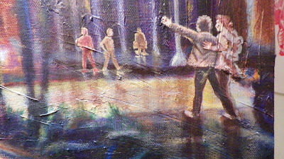
You can see the people on the left starting to look more detailed now.


Along with detail, the characters personalities emerge.

Here is a little better lighting on the whole image now.

Everything is starting to blend a little better.


This is it, shadow, highlights and reflections. I added a few bright leaves that are reflecting sunlight in the trees.

Here I added some nice spring flowers and my final signature.

Drum roll please ... Finished.
Stick around for more, my client commissioned me for another painting.


Social Plugin