

Blade Runner and Prisoner of the Mind Visual Symmetry.
Black and white ink drawings are a lot like ones and zeros in computer language. In combination, either they work or they don’t. If you are, an artist and you've ever had to ink your own drawings you know that too much black or not enough can make or break the mood of the drawing. It’s a process I am still learning after twenty-five years.
I am a big fan of film noir. Every time I watch one, I try to understand the light and shadow, the mood and emotion that a certain scene portrays. For my graphic novel, I tried to instill some of that in each panel. Although Blade Runner is not technically a film noir, it too has the same emotion and mood of many of those early films.
I have great respect for the film, and out of curiosity, I wanted to see comparisons between some of my panels, and the movie stills from Blade Runner. Whether I had intentional or subliminal visual symmetry I don't know, but here it is.


1. Setting the scene is important. Opening up your audience to your world vision really creates the atmosphere for the rest of the story.


2. From big view to close up or some type of skewed reflection sets the mood and shows extreme detail.


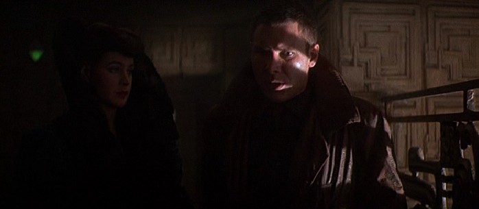
3. Smokey, hazy, low light or several different light sources cast strange shadows that create tonal contrast.


4. Heavy shadows in action help create a more intense experience.

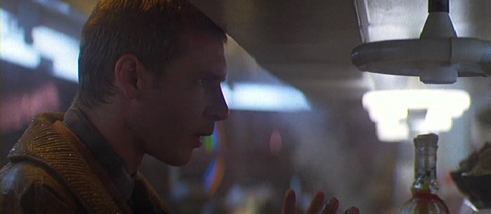
5. I typically try to study facial expressions to convey emotion in my drawings.


6. You can see that the film stills are extremely dark. I use a lot of black ink in my work, but if I were to go as dark as the film, I would have to use a black & white scratch-board technique which would be like inking a negative.


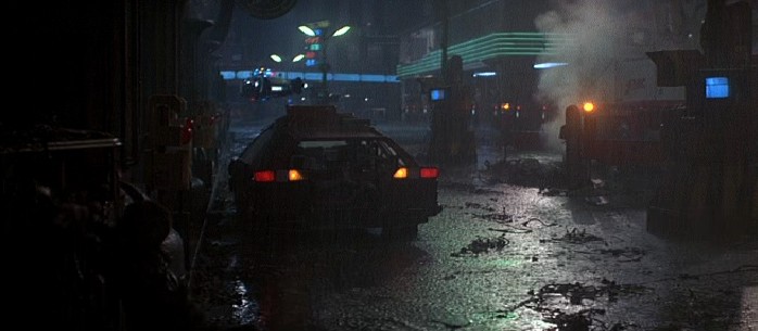
7. The big cityscape reveals overpopulation and density of a scene, almost creating a claustrophobic feeling.


8. Heavy contrast, harsh lighting and highlighted detail work great in film noir.


9. Find your light source and go to town. Contrast, contrast, contrast.


10. I like to mix up my scenes with several different perspectives. Sometimes a birds-eye view works well, other times you need an eye level perspective.


11. Cold, dark, misty, smoky, hazy... do you see where i'm going with this, give it mystery.


12. Include closeups with big shots and you'll have some fun. With Wally Woods 22 panels that always work, you can't go wrong.


13. New York


14. Sometimes adding a man powered vehicle in a futuristic setting add's a sense of realism. Even if all of the cars in the world could fly, you will still have people of a certain socioeconomic standing that cannot afford a flying car.


15. Think about how humans build. Underground, above ground, use all the elements of public transportation to give your story diversity.


16. Contrast with alternative light sources can give a great deal of variety and add intrigue to any scene.

17. Shadows and reflection can play with your scene to make a strong statement.


18. Photo's, or some type of personal effect gives your characters emotion and feeling.


19. Advertisements are everywhere, think about it the next time you walk down the street and try to count how many logos and signs you see. You will be surprised.


20. Big silhouettes against a lighted background in comics and film have been used for many, many years.


21. We know that technology must be incorporated into a story somehow, somewhere. Be creative and see what you can do.


22. There is always a place for an extreme close up, the eyes tell the story.


23. I try not to use too many splash pages in my work, but when I do, I try to give it depth.


24. Contrast and shadow will help support your action pages.


25. Insert a moment of contemplation to show emotion, we are all human and we think. (well, most of us anyway) Yes, the anatomy is off, I started drawing this graphic novel a long time ago. I have greatly improved since those days, but I thought I would include it because the emotion is still there even if my skill wasn't.


26. Take a potentially boring action shot and give it some mystery. Smokey, hazy, dimly lit.


27. Humans do many mundane activities such as drinking, eating, sleeping, ordering food, making phone calls, etc... If they're part of your story, try to give them a sense of attitude.


28. Harsh features, dramatic contour, a sense of melancholy are all part of film noir.


29. Varying your panels to show a human quality will pull your audience into a more personal realm that they can associate with.


30. Pain, five o'clock shadow, water, hair, wrinkles... Just a few things we all have to deal with. These elements make drawings more real regardless of your style of drawing.


31. Bandages are great for storytelling. If you are drawing a black and white series, it's sometimes hard to show your hero getting beat up, bruised and bloody, but dirt and bandages help sell it.


32. Profile, figure, stance and contour can give your character personality just like the individuals that we are.


33. Mistakes and weakness give the impression of human qualities. If we were all invincible then we wouldn't be very interesting, hence the main reason I don't really do any superhero stuff.


34. Depth, tonal contrast and texture help bring the viewer into your world.


35. Awkward handling of objects when fumbling also project a sense of realness. We are not all surefooted or have a G.I. Joe grip. Then add dramatic lighting through a window that cast long eerie shadows and you have something more interesting.


36. Like looking down a hollow pit or a crater, you want to create a sense of depth and pick the best way to view your scene. From above or below, sometimes I draw a scene from different angles just to see how it will look in the end.

37. A transportation rear view sometimes create submersion in a scene, because your mind will want to make you walk around to the front to see what's going on. This creates a sense of conundrum.


38. Movement with out moving is what I call it. Rain, water ripples, leaves, and papers blowing in the wind, are all props that can give a static drawing a bit more intensity and a sense of perceived movement.


39. Sometimes I try to visualize humanity pitted against the unstoppable machine of modern progress. Someone in the wrong place at the right time, flesh and bone against concrete and steel. We may carry guns, and wear armor, but in the end bones break, and the human eggshell is feeble.


40. These elements of humanity can be in your face, or subtle like bandages covering a wound.


41. Unlike the close up of facial expressions that will convey a certain emotion, extreme technical close ups are sometimes needed for spatial reference, and medium.


42. Perceived slow motion is very hard to create, but it can be a really nice effect in static artwork. It creates a sense of intensity and detail that suck you in as a viewer.


43. Not all parts of your story can be told with a "this is this", and "this is that" attitude. Sometimes, you will need a subtle hint of something that can create a metaphor for more. This reveals your characters emotions outside of dialogue.A scene of higher elevation and emotional significance will set your work apart from the rest.
Thank you Bladezone.com for the video still archive, compiled by Richard Gunn
"Blade Runner" is a trademark of the Blade Runner partnership.
All film artwork & photography © Ladd Company 1982.
All film artwork & photography © Ladd Company 1982.


Social Plugin